
RETHINKING MARKET COMPARISONS – A NEW DEFINITION FOR COMPA-RATIOS
Employers use salary surveys to measure the market and remain competitive. But making such a comparison can be quite difficult, even misleading. Conventional wisdom tells us to compare average incumbent salary to survey data by the job. This is commonly referred to as the compa-ratio.
Suppose your target market position is the 50th percentile value from your survey, say 110,000. If your company’s incumbent value for the same job is 98,650, the compa-ratio is 89.7. This means your compensation value is 89.7% of the target, or to put it another way, 10.3% below market.
Wait a minute! Is this right? What if there is more than one incumbent, say one earning 98,650, and another, earning 121,330. We can just use the average, 109,990. The compa-ratio has changed to 99.9. So we’re right on target. Phew!
You can see that as more data is introduced to the mix, the average will change and so will the compa-ratio. It’s kind of misleading, isn’t it?
There is another way. As we explained in a prior post in this series, about percentiles, your target market position is a range, not a single value. In our example above, let’s try the comparison in a slightly different way. Instead of looking at the average of all the incumbents in a particular job or grade, let’s compare your salary range to the market salary range. That’s right. Compare your minimum to the minimum in the survey, and the maximum to the maximum in the survey. The graph below illustrates the concept.
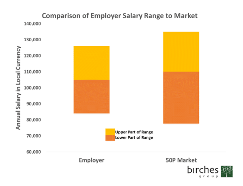
The left column shows the employer’s salary range, while the right column illustrates the range found in the market. The orange portion represents the upper portion of the range, from midpoint to maximum, while the rust portion represents the portion from the minimum to midpoint. The employer range is symmetric, with the midpoint exactly in the middle of the range, while the market data is shows the incumbent average as the “midpoint”, not exactly in the middle of the range, but reflecting the actual practice in the market.
At first glance, it appears the employer’s range is just fine. It is entirely within the market range at the 50th percentile, according to the company policy. Let’s take a closer look.
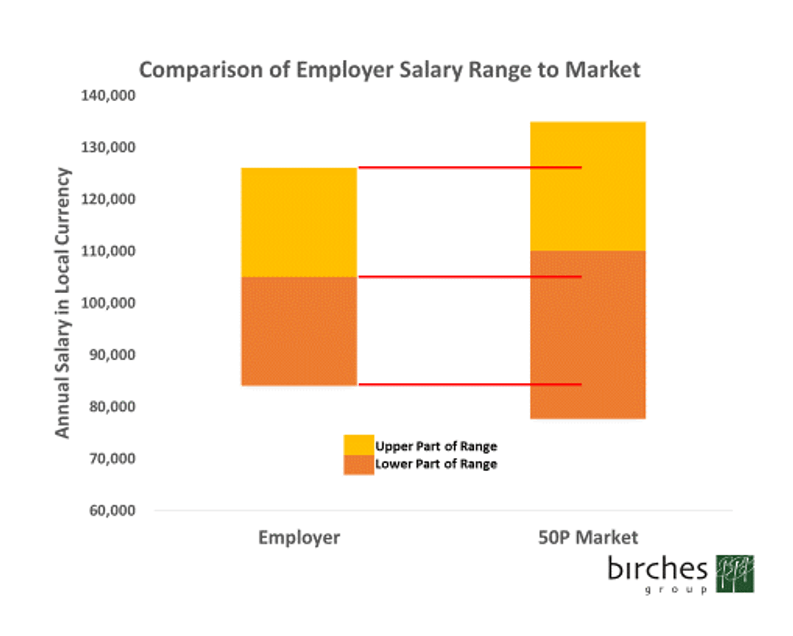
The red lines in the second graph show how the employer range overlaps with the market. The incumbent average in the market is clearly higher than the midpoint of the employer’s range, and the market span (distance from minimum to maximum) is wider. This means that the employer is paying a bit more for new entrants, but their pay is capping out sooner than the market for experienced talent. Each employer needs to decide if this is a desirable outcome for their unique situation.
How can the compa-ratio concept be applied to this comparison? At Birches Group, we often do such a comparison as follows:
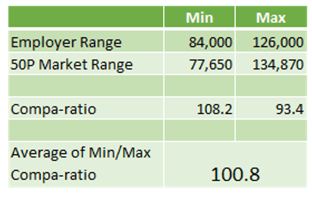
So, this indicates that the employer is very close to their target – just 0.8 above. They are 8.2% above at the minimum, but trailing the market maximum by 6.6%.
What else does this sort of comparison tell us? First, it allows a comparison of your salary range spans to market spans. Oftentimes, clients simply assume spans are the same in every country and at every level of the organization; our data shows that this is simply not true.
Second, you can understand the range penetration in the market – how close to the maximum is the incumbent average? Is it around the middle of the market span, or closer to the minimum or maximum? This provides additional insights to employers when updating their ranges.
Finally, you can start to use your salary structure as more than a compensation metering tool. For example, if you align your spans to your organization structure properly, then for grades where you have jobs for which there is no path for upward mobility, you can deploy wider ranges to allow for pay growth over time without promotions. Similarly, in grades where the expectation is up or out in a short period of time, a narrow span could work just fine.
In Summary
Relying strictly on incumbent average comparisons to market medians is a misleading approach which is subject to volatility when incumbent data shifts. Comparing salary ranges to market ranges is a powerful alternative (or supplement) which provides employers with additional market insights.
We hope you are realizing that our effort to rethink salary surveys is from top to bottom! There’s a lot to consider when comparing yourself to the market. But the most basic comparison – the compa-ratio – can be redefined in a very powerful way.

Warren joined Birches Group in New York as a partner in 2007, following a long career in Compensation and Benefits at Colgate-Palmolive. He held the position of Director, International Compensation for 10 years immediately prior to joining Birches Group. Warren has broad experience working across the globe with clients on local national and expatriate compensation projects. He leads our Business Development and Client Services teams and manages our strategic partnerships around the world. Warren previously held leadership positions for the Expatriate Management Committee of the National Foreign Trade Council and was president of the Latin America Compensation and Benefits Forum.
